

There is something very satisfying when you have a consistent and cohesive brand presentation across all your channels. Getting these essential branding elements right gives you confidence. It means you’re doing what’s necessary to present the best version of your business. However none of that happens by accident. You’ll find that when it looks effortless and straightforward , there’s been some investment to make it happen.
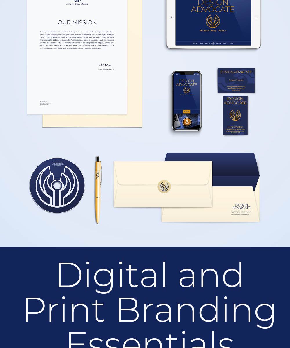
This mock up gives you an idea of how a brand can be presented across a number of different formats and mediums. Tying digital and print is an essential branding issue to get right. However so is getting a consistent and positive user experience of your brand across a variety of media. The first step is having a clear understanding of your brand identity and if you’ve never been through the process, I’d recommend it. It helps bring a clarity to all of your visual communication. It speeds up your use of your branding and removes all those nagging worries about selling yourself short.

Getting your logo responsive
One of the essential branding elements to get right is how you use your logo in different digital contexts. If you have a tall brand mark, how does that work in landscape mobile setting or a Facebook cover image? Conversely how does a square logo mark use the surrounding space in different contexts. This all needs thinking about beforehand and it’s what sets professional design apart. In designing my own branding, logo and site I gave priority to a cohesive and digitally responsive design.
This site is based on the basic Twenty Seventeen WordPress theme with some child-theme modifications. One of the changes is to create a responsive logo and business name landing page. This was the one thing that many trying to update this theme complain about. Getting that to work across varying media width and orientation is very satisfying. I’ll provide some details about that, I’m sure in a blog post in the New Year. Most of the rest is custom css styling and some flexbox html to improve responsive layout. A little bit of animation was achieved with a few javascript libraries.
Using SVG for retina display
I’ve always been a big fan of vector graphics and have loved the scalability that comes with this format. With this in mind creating Scalable Vector Graphics (SVG) for elements on sites solves a lot of the responsive challenges. This is because they scale perfectly and look super crisp on large retina displays and modest vanilla smartphones. For a business wanting to re-use branding elements they’ve invested in, knowing they will just work is another headache sorted. I’ve made a point of using SVG graphics as much as I can and have even done some basic animation. This is a fun side project at the moment, but we’ll see more animated effects in 2020.
If you’ve got a project in mind that you’d like to discuss, especially if you’re thinking it’s time to revisit your approach to branding, I’d love to talk about working together.
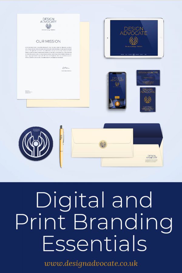
Credit where credits due, this mock up is from graphicburger.com with some updated apple products from me.