

Strategies with negative space is part of a series of midweek posts focused on design. You can thank Brian Eno and Peter Schmidt for these quotes as they are from their set of cards called ‘Oblique Strategies’. The aim to provide a sideways nudge to creatives who need a bit of course correction.
Making our first marks
As a designer this seems so relevant to me as I use lines to create all the time. But a line is rarely a simple thing in isolation. It works as part of a whole, defining areas, creating contrast, divisions, you name it. But what immediately springs to mind is the idea of negative space. More often than not we work with positive space. This is the space we define by adding marks to our creation. It’s no surprise this is our natural way of thinking as it’s rooted in our first mark making. We made positive marks with our first crayons, paints and dirty fingermarks! We use a pen or pencil not an eraser to create our everyday communication. But we’ve also been making negative marks, the earliest of which you can see in hand stencil cave paintings around the world.

The hand used as a stencil becomes the negative space shape inside the positive pigment blown onto the wall. Simple but very effective at leaving your mark.
For me this is the take-away nudge of these strategies for negative space design. Draw with an eraser in mind now and again. Stop just thinking about what shape the line includes but also think about what it might exclude.
This idea of using negative space in logo design is not new but is a great way of showing intelligent design and communicating visually. I’ve picked a few favourites that show this in use really well.
The Guild of Food Writers
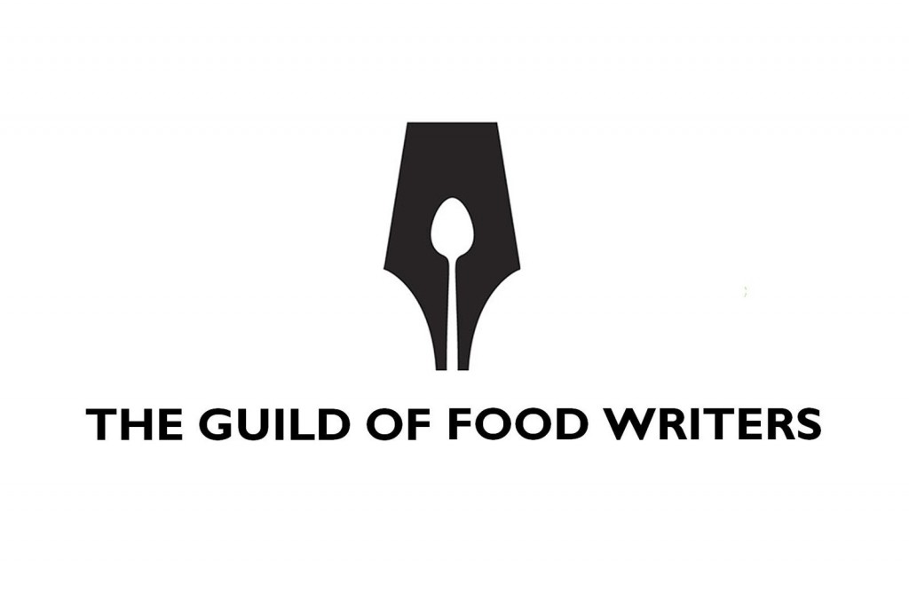
This is such a great design in so many ways. It’s simple, and simple is harder than it looks to do well. It communicates writing first through the large nib outline and food too through the spoon shape . It’s only a subtle change from the actual reservoir in the nib shape but that’s what makes it so good. You should check out their logo use on their website too. It sits in a top header banner on desktop and mobile, but I think it’s most effective in mobile format because it’s more obvious how they use the negative space spoon as an actual cut-out. Again simple but clever brand communication.
FedEx
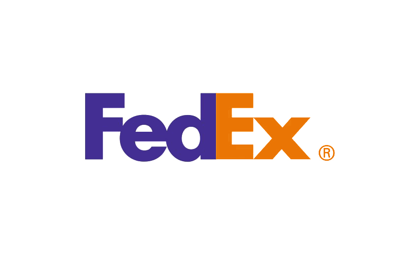
A redesign in 1994, created the FedEx logo that you see above. The previous logo mark was just a large Federal Express word mark on a slant. The new logo uses the negative space between the capital letter E and lowercase x to create an arrow. This is a great design feature. It demonstrates again how a simple looking idea done well looks effortless and obviously right. It is very apparent looking at the previous branding shown below, it was in need of updating, it looks positively retro now. But not in a good way.

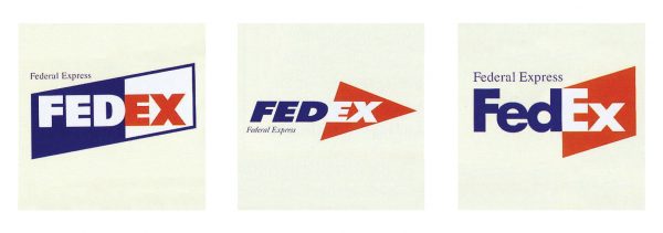
You can see the design intention when looking at some of the other ideas presented to the client during the redesign process. Incorporating the arrow was not an accident but deliberately there to communicate the movement focus of the company. It’s interesting to me that the angled boxes and all capital letters are connections with the old logo, and they fell by the wayside with the new design.
Noma Bar
One of the most inspirational proponents of design strategies with negative space is an illustrator called Noma Bar. He’s well known for using the negative spaces in a design to convey as much meaning as the positive marks. A recent well known example of his work is the book cover design for Margaret Atwood’s latest book, The Testaments.
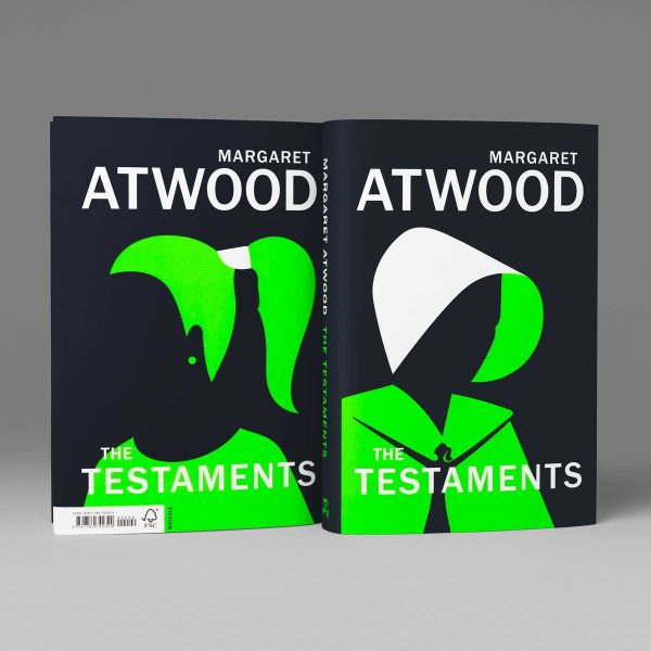
There’s so much to like about this design, especially if you’ve read or watched the Handmaid’s Tale. The dramatic colour change from the ubiquitous blood red of the first book, to the vivid contrasting acid green, is a great choice for signposting the changes coming. You can see the perfect pared back images of the cowl and ponytail, representing oppression and freedom. The effortless simplicity and reduction of forms is a testament to Bar’s restraint and ability to declutter an image to its purest voice. Love it.
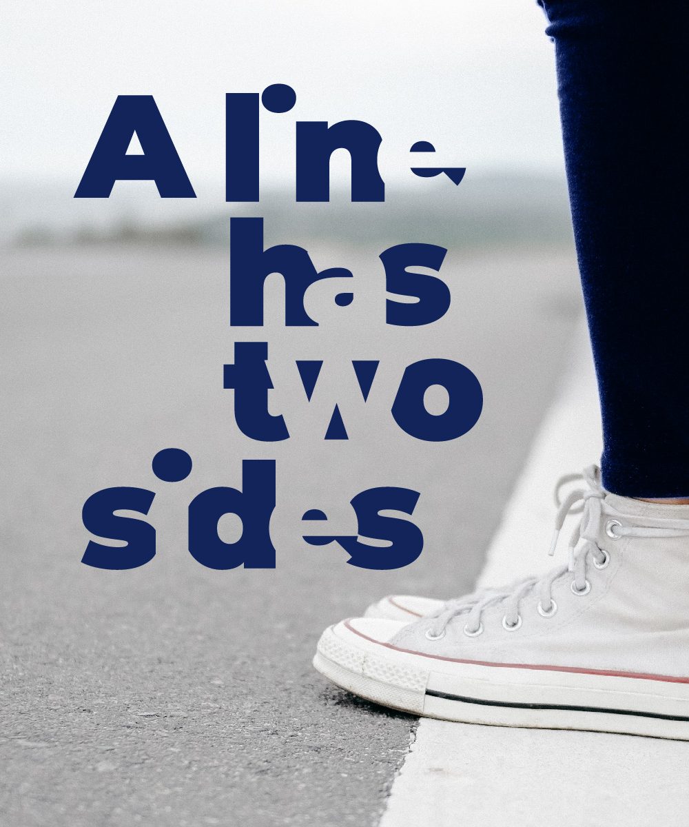
I’m positive that negative space adds to design
So in terms of oblique strategies for design, next time you’re taking your pencil for a walk. Stop and consider how to use what that line is defining. The positive space contained within the shapes and the negative space between the shapes can both speak as loudly as each other.
Credit where credit’s due, the cave painting picture was taken by Mariano [CC BY-SA 3.0], via Wikimedia Commons, and my post pin uses a photo by Dương Nhân from Pexels .
Till next time and if you’ve got some ideas or stories of your own, don’t keep them to yourself now. Sharing is caring, so like, pin, share and comment.
More Oblique Strategies here.